When we think of logos, fonts often come to mind first. And while typography plays a key role, a memorable logo is built from more than just letters. A powerful logo distills your brand into a visual mark that’s clean, impactful, and instantly recognizable — with or without words.
Fonts may be your starting point, but the real strength of a logo lies in its form, clarity, and meaning. A successful design captures attention, evokes feeling, and represents your brand across all platforms. If you’re just beginning, platforms like Creative Fabrica offer a wide array of free fonts to kickstart your creative process — but the font is just the beginning.
Start with Shape: Let the Form Speak First
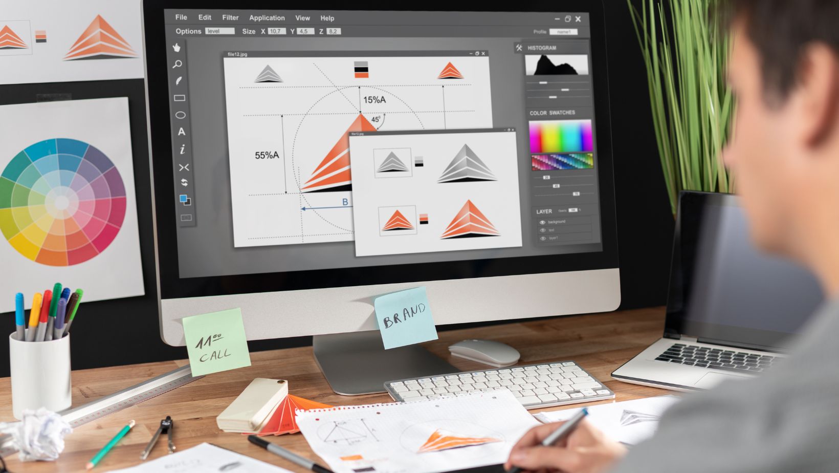
Before choosing colors or typefaces, focus on the shape of your logo. Why? Because shape is the foundation of visual memory. Strong logos often communicate through silhouette alone — think of the Nike swoosh or the Apple icon.
Start by sketching simple forms: circles, triangles, squares. These shapes create structure, balance, and visual flow. Build your idea within or around them, allowing the form to lead the eye and express your brand’s character.
Ask yourself:
- Would this logo work without any text?
- Is it recognizable in black and white?
- Does the shape align with the brand’s tone and purpose?
Designing from shape first ensures your logo scales across touchpoints — from social icons and app buttons to print and merchandise. If the shape is the face of your brand, the font is its voice.
Use Color Thoughtfully to Convey Emotion
Color speaks faster than words. It sets the mood, builds association, and shapes perception — but only if used wisely. Instead of flooding your logo with color, begin with one or two hues that match your brand’s emotional tone.
For example:
- Red evokes energy and urgency
- Blue suggests calm, trust, and professionalism
- Green feels natural, organic, and clean
Choose colors that reflect your industry and audience. A tech brand may benefit from cool, restrained tones, while a children’s brand may need bold, playful shades.
And always test your logo’s color adaptability:
- Does it work in grayscale?
- Can it sit on both dark and light backgrounds?
- Is it still effective in full black or white?
A versatile logo design doesn’t depend on color — it’s enhanced by it.
Embrace Simplicity: Readability Is Power
One of the most common pitfalls in logo design is overcomplication. Too many details, textures, or fonts dilute the message and weaken the impact. Strong logos are simple and legible at a glance.
Stick to one font whenever possible — clean, modern typefaces often work best. If you’re unsure where to begin, check out free resources like Creative Fabrica’s font library to explore reliable, professional options.
Avoid unnecessary effects like drop shadows, inner glows, or micro-icons within your design. These elements often get lost at smaller sizes and reduce scalability.
 As designer Md Tamzid Mahmud puts it:
“Your logo is your brand’s first impression. When people connect with your visuals, they’re more likely to trust your message. Great logos come from balancing creativity, design logic, and execution.”
Remember — your logo doesn’t need to shout. It needs to speak clearly and confidently.
Add a Distinctive Symbol to Strengthen Identity
Symbols and icons help logos go beyond text. A unique mark — whether abstract or literal — adds instant recognition and expands how your brand can be used.
Tips for creating a compelling symbol:
- Merge initials or shapes in clever ways
- Stylize a product element into a simplified form
- Use geometric lines to convey movement, direction, or innovation
- Add hand-drawn accents for a human, approachable feel
The symbol should be versatile and scalable. Try using it on its own — in social profiles, app icons, or as a watermark. The simpler and more distinctive it is, the more memorable your brand becomes.
Test your icon at small sizes. Zoom out. Print it. Shrink it down to see if the essence still holds up.
Final Thoughts: Design with Purpose, Deliver with Precision
Creating a logo is not just about visual flair — it’s about solving a branding challenge. You’re designing a symbol that reflects values, communicates identity, and functions across all media. Every line, shape, and shade should serve a clear purpose.
Here’s what the best logos have in common:
- Memorable at first glance
- Versatile across platforms and formats
- Simple enough to scale, yet rich in meaning
- Rooted in the brand’s tone, mission, and voice
Think beyond the font. Begin with shape. Use color with care. Craft your symbol. And always test your design in context — from a website header to a coffee cup or mobile screen.
A logo that survives every test and remains instantly recognizable is more than a mark — it’s the visual signature of your brand. And with the right approach, you’re well on your way to designing something timeless.